Posts tonen met het label alphabet completed. Alle posts tonen

dinsdag 24 mei 2011

Zuiderzee Museum - NIJVER|heden

For the exhibition NIJVER|heden: Industrious Artefacts, the evolution of crafts we've been working on the signage and a booklet. The show runs from May 27th 2011 - February 12th 2012 at the Zuiderzee Museum in Enkhuizen.

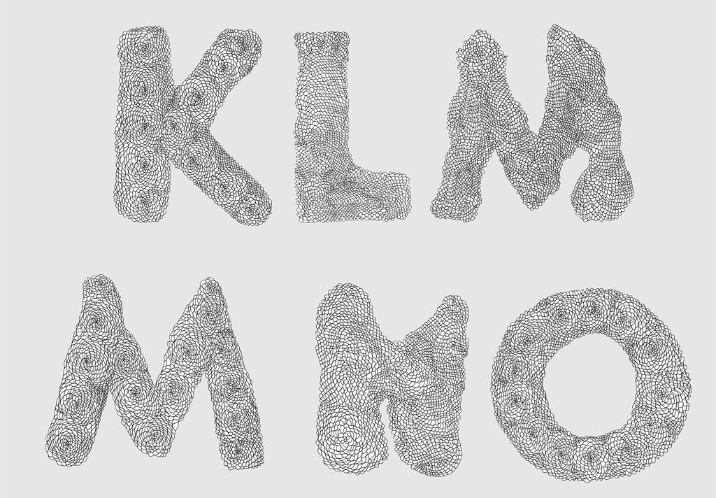
For the design the Scratched Letter from 2003 was revived. We constructed the main titles of the show from yarn on wood.

Signage in the exhibition / yarn on wood
picture taken from www.edhv.nl

Booklet / laser print on paper
For the booklet we made the digital letter into a working typeface with a lot of weights and alternates.

Inkjet print on wood / test

NIJVER|heden: Industrious Artefacts, the evolution of crafts:
May 27th 2011 - February 12th 2012, Zuiderzee Museum, Enkhuizen

Curated by Studio Makkink&Bey: with Klaske Oenema (introductory animation), Atelier NL, Maarten Kolk, Lucas van Vugt, Florian de Visser, Studio FormaFantasma, mischer 'traxler, Kieren Jones, Jetske Visser, Merel Karhof, Raw Color, Marloes ten Bhömer, Dirk van der Kooij, EDHV, Mark Braun, ZIETA Prozessdesign, Will Shannon, Unfold & Tim Knapen, Trikoton, Jelte van Abbema, Sonja Bäumel, Elisa Strozyk, Studio Glithero, Greetje van Helmond.


With thanks to Michiel, Amber Vork, Babette Zijlstra and Nienke Kersen to help make this project happen.

donderdag 11 november 2010

woensdag 2 juni 2010

donderdag 13 mei 2010

Kool


I started drawing this letter to use on a silk screen poster. I got a bit carried away on the thin-lined details. On top of that I had to scale them down for the poster. These letters didn't make it to the poster. I finished the alphabet anyway, and will figure out a purpose for them at some point.


I'm trying out a Pilot 0.4 mm G-Tec-C4, which somebody gave to me after a lecture I held in The Hague. (You see nothing of the pen since I scanned it in Bitmap, but it's nice to have a sharp line and be able to press really hard while drawing without damaging the nip of the pen like you do with fine liners.)

woensdag 24 maart 2010

Update - Doily Type

Added two more C's to Doily Type today.


I make several versions per letter to avoid using the same letter twice in one word. This is the collection up to now.


donderdag 5 november 2009

woensdag 4 november 2009

Doily Type


Type design. Applied for gallery W139 poster and signage for Droog Design in New York. For an update, click here.

zondag 4 november 2007

Grid Letter


Sketches for New York Times Magazine.

zaterdag 4 november 2006

Wire Type


Wire Type was applied for embroidery on a bag by Wieki Somers / Dutch Textile Museum, Tilburg (NL). Also used for my moving announcement.