Hansje van Halem (1978) is an independent graphic designer in Amsterdam. She graduated from the Gerrit Rietveld Academie (2003). This blog is an addition to her portfolio website.
Currently filling a 70 x 100 cm sheet with a fine liner drawing. It's hard to keep up with the symmetry when the shape gets this big and the drawing sure has its stages of ugliness. But after drawing for a week, stopping is just not an option... In progress 1 In progress 2 Detail
Can't seem to stop drawing as I did for Doily Type. It's like ice skating on paper with my new set Rotring Tikky Graphic - pigmented ink - fine liners (0.3, 0.5 and 0.7 mm) on slippery Atlanta 80 grs coated paper. Original drawing size about 28 x 28 cm.
Sketch for a new poster for Schrank8 Home Gallery. Detail of a sketch, 0.35 mm Rotring Rapidograph pen. Detail of a silk screen print. Purple on grey card board.
I started drawing this letter to use on a silk screen poster. I got a bit carried away on the thin-lined details. On top of that I had to scale them down for the poster. These letters didn't make it to the poster. I finished the alphabet anyway, and will figure out a purpose for them at some point. I'm trying out a Pilot 0.4 mm G-Tec-C4, which somebody gave to me after a lecture I held in The Hague. (You see nothing of the pen since I scanned it in Bitmap, but it's nice to have a sharp line and be able to press really hard while drawing without damaging the nip of the pen like you do with fine liners.)
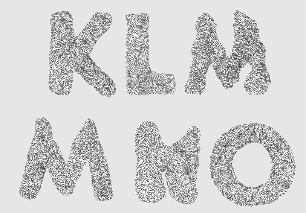
Added two more C's to Doily Type today. I make several versions per letter to avoid using the same letter twice in one word. This is the collection up to now.
I received an e-mail from a student of the Willem the Kooning Academy in Rotterdam. For a school assignment she proposed a bet that she could make a letter more fiddly than mine. It made me laugh really hard. So Margriet... !
I'm currently trying to figure out how to translate photographs into hand-dotted images. The original picture that is worked from for first two samples is already quite abstract. That makes it hard to tell wether it works or not. The two samples you see below have different pre-press input. (See my portfolio for the end result.) Photograph dotted with a 0.4 mm Stabilo fineliner, dotted in two densities. Simplified photograph dotted with a 0.4 mm Stabilo fineliner, doted in two densities.
First test converting a full color image into a dotted drawing: Tijl in CMY. Nine layers of drawing in three different pen-types: 0.4 mm Stabilo, 68 Pen Stabilo and Bic Marking 2000.
I just realized that the step to make these drawings are directly inspired on a drawing by my father I recently saw on his blog. Sorry Pim and thanks!
Hansje van Halem is a graphic designer. She works and lives in Amsterdam, the Netherlands. On this blog you can find a selection of her type drawings, sketches and failures. For commissioned work, please check the portfolio site.


 !
!


